App design system
This design system follows the current Flutter theme and device captures. It packages light and dark color roles, typography, dimensions, components, and motion for product design, engineering, and AI-assisted work.
GuppyCubed App
A clear native interface for work in the field. Brand red is reserved for primary actions and selection, while neutral surfaces, visible borders, and touch-safe dimensions keep the product dependable.
- Best fit
- Sign-in, assistant, knowledge, recording, collaboration, and settings.
- Watch out
- Do not flood backgrounds with brand red or import web-hero typography into native hierarchy.
Token snapshot
The identity-bearing decisions, rendered.
app.color.primaryPrimary actionapp.color.backgroundPage backgroundapp.color.surfaceCards and controlsapp.radius.controlInputs and buttonsapp.control.primaryPrimary-button heightapp.motion.rangeControls and overlaysColor roles
Keep each color inside its documented product role.
Light semantic colors
Gray-white backgrounds and white surfaces establish hierarchy; brand red is reserved for action and selection.
#C3102EPrimary buttons, focus, selection#A20D27Text actions and active states#F5F6F8Scaffold background#FFFFFFCards, fields, and overlays#EFF1F4Secondary sections and selected fills#202124Primary text#626975Supporting information#E5E7EBDividers and component boundariesDark semantic colors
Dark mode preserves the same roles instead of applying a simple inversion.
#101216Scaffold background#191C22Cards and controls#242831Secondary sections#F3F4F6Primary text#B0B6C1Supporting information#373E4ADividers and component boundaries#FF7A8EDark-mode errors and riskTypography
Type roles follow product density instead of decoration.
28 / 36 · 700Page and major-state headings
22 / 30 · 600App bars and dialogs
17 / 24 · 600Cards and list titles
16 / 24–25 · 400Primary reading and form content
13 / 18–19 · 400–500Time, source, and supporting copy
Layout, shape, and motion
A compact foundation for consistent implementation.
All padding, gaps, and section spacing.
Normal-text contrast and minimum touch target.
Keyboard focus never relies on color alone.
Text actions, controls, cards, dialogs and sheets.
Ordinary surfaces stay flat; floating layers establish depth.
Transition transform, opacity, and color only.
Components worth studying
The patterns that make the system recognizable in use.
- 01
Top app bar: zero elevation and a quiet surface after scrolling.
- 02
Filled button: 52px high, 14px radius, brand-red fill with white text.
- 03
Input: 16px padding, 14px radius, brand-red focus border.
- 04
Card: 16px radius and 1px border; ordinary hierarchy does not rely on shadow.
- 05
Dialog and sheet: 24px radius with focus returned to the invoking control.
Product previews
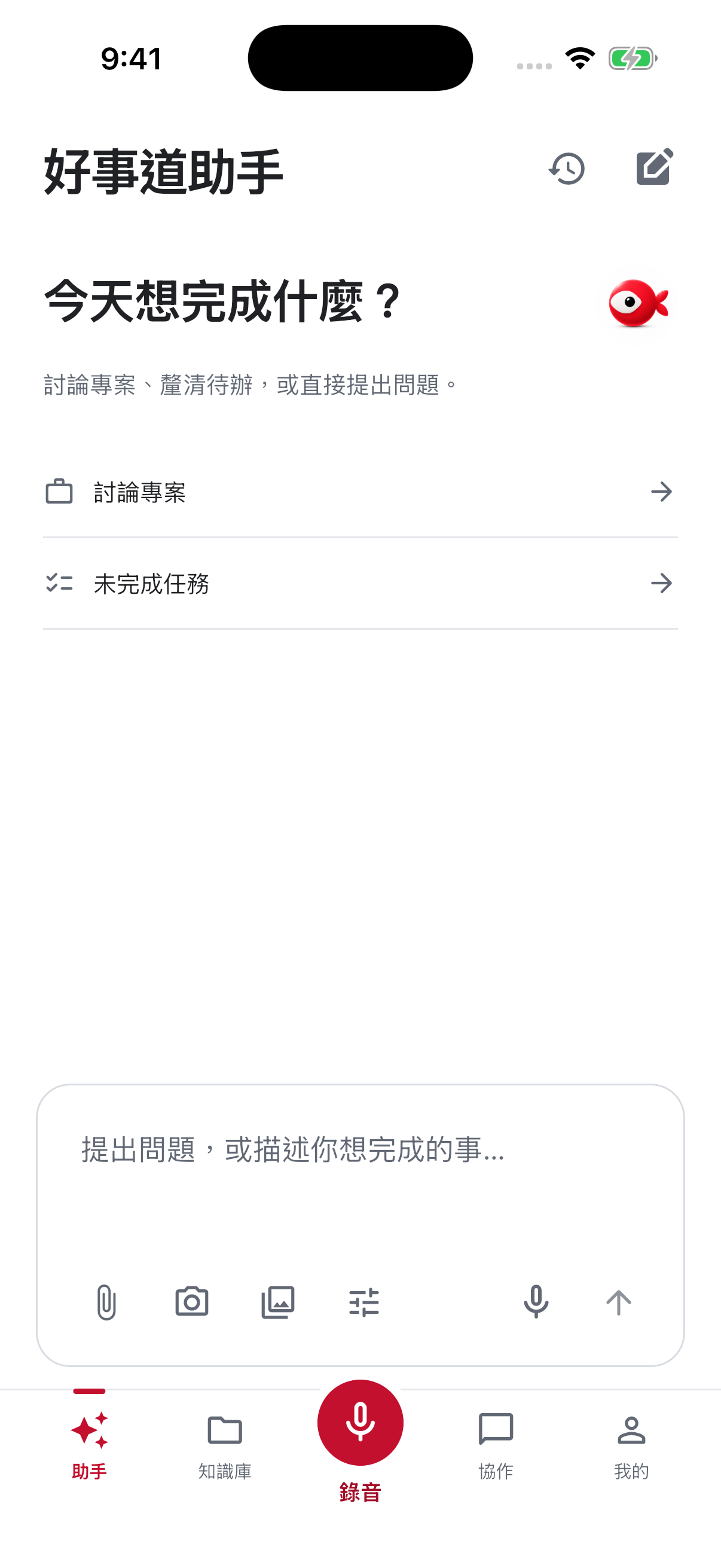
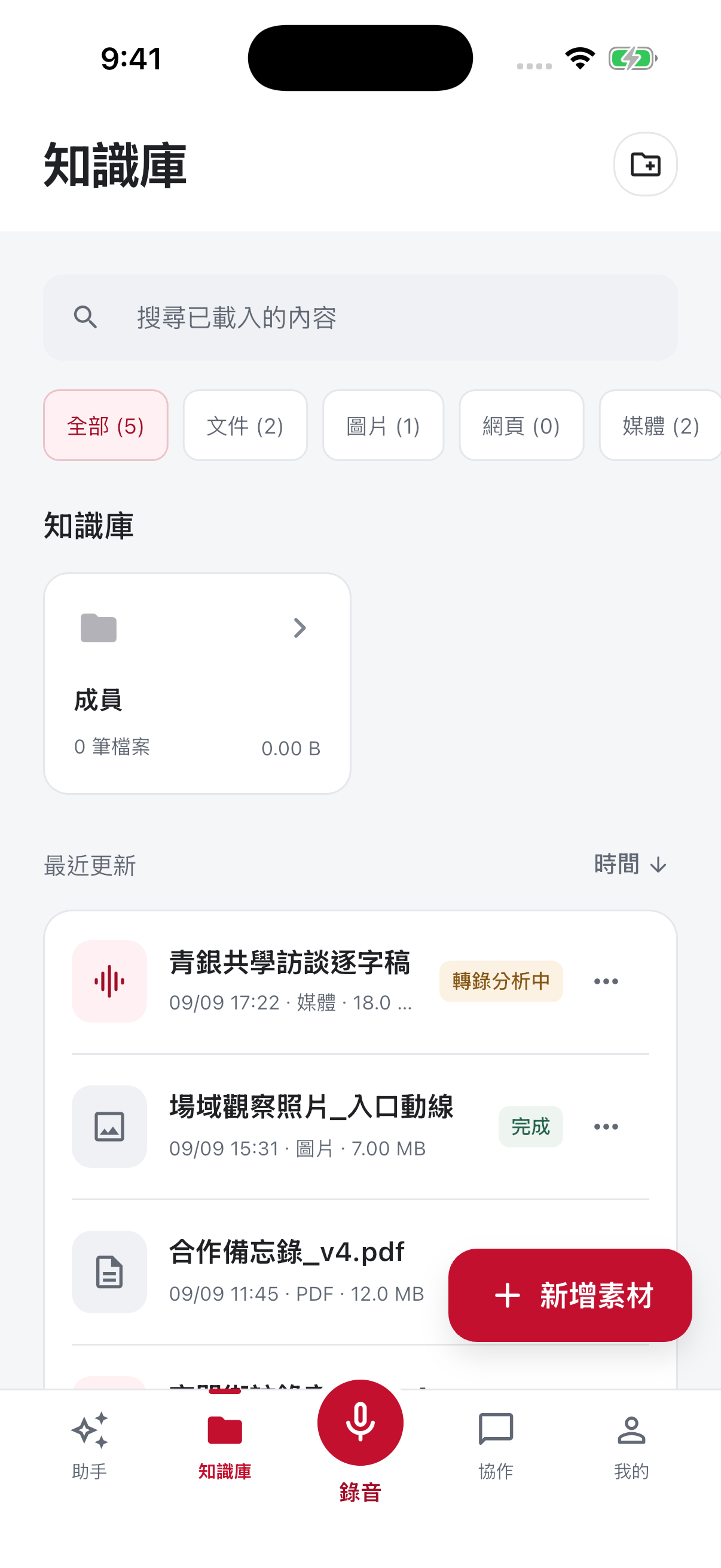
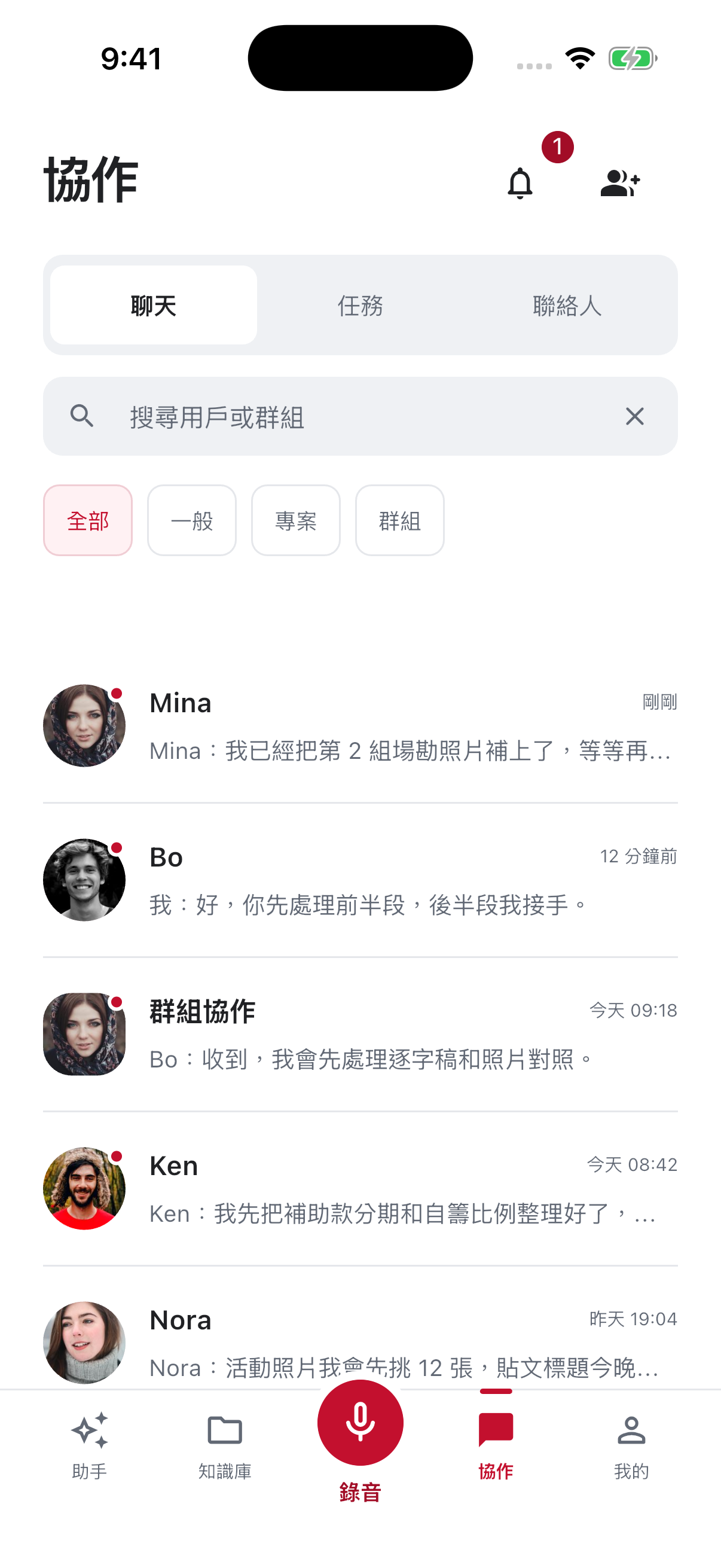
Real captures show how tokens behave in context.
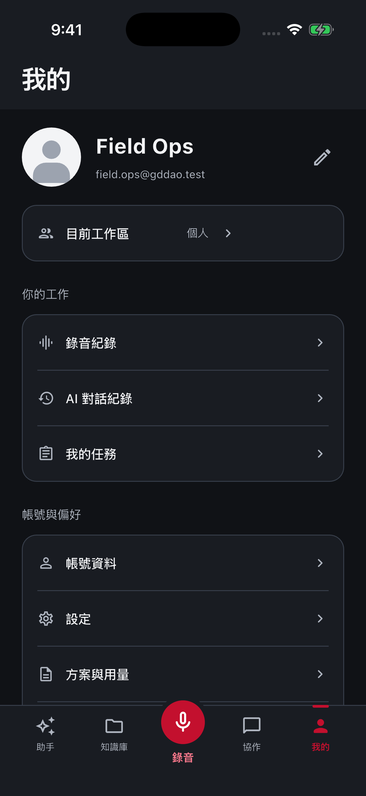
The file, before you copy it
Copy this platform design.md into an AI coding tool as styling context.
---
system: GuppyCubed App
owner: GuppyCubed
platform: app
verified_at: 2026-09-22
method: restated-from-current-product-theme-and-captures
---
# GuppyCubed App — Design Style Reference
## Summary
A clear native interface for work in the field. Brand red is reserved for primary actions and selection, while neutral surfaces, visible borders, and touch-safe dimensions keep the product dependable.
## Color tokens
### Light semantic colors
| Token | Value | Role |
| --- | --- | --- |
| Primary | `#C3102E` | Primary buttons, focus, selection |
| Primary deep | `#A20D27` | Text actions and active states |
| Background | `#F5F6F8` | Scaffold background |
| Surface | `#FFFFFF` | Cards, fields, and overlays |
| Surface alt | `#EFF1F4` | Secondary sections and selected fills |
| Text | `#202124` | Primary text |
| Muted text | `#626975` | Supporting information |
| Border | `#E5E7EB` | Dividers and component boundaries |
### Dark semantic colors
| Token | Value | Role |
| --- | --- | --- |
| Background | `#101216` | Scaffold background |
| Surface | `#191C22` | Cards and controls |
| Surface alt | `#242831` | Secondary sections |
| Text | `#F3F4F6` | Primary text |
| Muted text | `#B0B6C1` | Supporting information |
| Border | `#373E4A` | Dividers and component boundaries |
| Danger | `#FF7A8E` | Dark-mode errors and risk |
## Typography
| Role | Size / line / weight | Use |
| --- | --- | --- |
| Display / headline | `28 / 36 · 700` | Page and major-state headings |
| Title large | `22 / 30 · 600` | App bars and dialogs |
| Title medium | `17 / 24 · 600` | Cards and list titles |
| Body | `16 / 24–25 · 400` | Primary reading and form content |
| Metadata | `13 / 18–19 · 400–500` | Time, source, and supporting copy |
## Layout, shape, and motion
| Token | Value | Rule |
| --- | --- | --- |
| Spacing | `4 / 8 / 12 / 16 / 24 / 32 / 48 / 64` | All padding, gaps, and section spacing. |
| Accessibility | `4.5:1 · 44 × 44` | Normal-text contrast and minimum touch target. |
| Focus | `3px visible ring` | Keyboard focus never relies on color alone. |
| Radius | `12 / 14 / 16 / 24` | Text actions, controls, cards, dialogs and sheets. |
| Elevation | `Border first` | Ordinary surfaces stay flat; floating layers establish depth. |
| Motion | `100–280ms` | Transition transform, opacity, and color only. |
## Component rules
- Top app bar: zero elevation and a quiet surface after scrolling.
- Filled button: 52px high, 14px radius, brand-red fill with white text.
- Input: 16px padding, 14px radius, brand-red focus border.
- Card: 16px radius and 1px border; ordinary hierarchy does not rely on shadow.
- Dialog and sheet: 24px radius with focus returned to the invoking control.
## Product previews
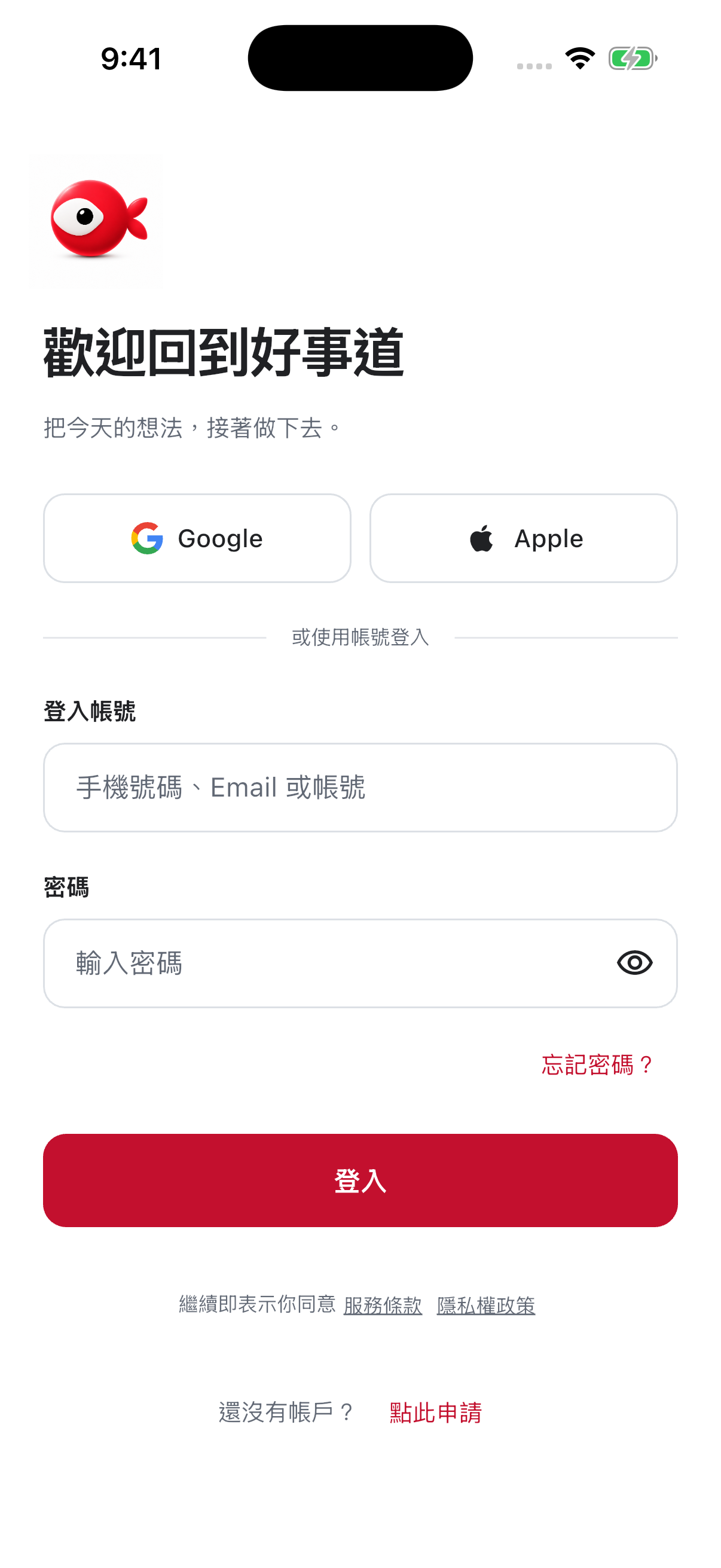
### Sign in
[](https://docs.guppycubed.com/en/img/guides/mobile/login.png)
### Assistant
[](https://docs.guppycubed.com/en/img/guides/mobile/assistant.png)
### Knowledge
[](https://docs.guppycubed.com/en/img/guides/mobile/knowledge.png)
### Collaboration
[](https://docs.guppycubed.com/en/img/guides/mobile/collaboration.png)
### Dark mode
[](https://docs.guppycubed.com/en/img/design-language/captures/mobile-native-my-dark.png)
## Do's
- Choose colors by semantic role, not by screen location.
- Keep every primary action at least 44 by 44px.
- Use the same hierarchy and state names in light and dark themes.
## Don'ts
- Do not use brand red as a large page background.
- Do not replace borders and surface hierarchy with shadows.
- Do not communicate errors, completion, or selection with color alone.
---
_Generated from the current GuppyCubed public design-language reference._
Current app navigation
Reviewed the current interface on 2026-09-16. Organization workspaces use five entries:
- Assistant
- Knowledge
- Recording
- Collaboration
- Me
Recording is the central bottom action. Chat, tasks, and contacts are integrated into Collaboration. A personal identity enters the Impact Center instead of using the same tabs.
The brand name is GuppyCubed, and interface copy follows the app language. Primary color, dark mode, forms, keyboards, large text, and bottom sheets follow the current app interface and acceptance states.
The complete set of 115 Mobile captures, categories, dates, and dimensions is available under Implementation captures and acceptance sources.