Web design system
The web system serves the brand homepage, public-entry experiences, and the Portal product interface. They share brand and accessibility foundations while keeping typography, density, media, and functional-color roles distinct.
GuppyCubed Web
Two densities within one brand: the homepage and public entries use media, space, and display type for narrative, while Portal uses neutral surfaces, clear borders, and denser product hierarchy for work.
- Best fit
- Brand homepage, donation/activity/matching entries, and the signed-in Portal.
- Watch out
- Public-entry colors never become global brand colors, and homepage display rules do not transfer directly into Portal.
Token snapshot
The identity-bearing decisions, rendered.
web.color.brandBrand and product actionhome.color.conversionHomepage conversionweb.type.bodyPrimary readingweb.control.defaultDefault control heightweb.radius.scaleControls, cards, heroesweb.motion.scaleFast, base, and slowColor roles
Keep each color inside its documented product role.
Homepage and public entries
Black and white lead, red carries conversion, and functional colors stay within their entry contexts.
#FFFFFFHomepage and brand-content canvas#000000Headings and primary text#E11919Homepage primary CTA#F3D57ADonation CTA with dark text#F8DFC9Activity-entry surface#F9EDC2Matching-entry surfacePortal product interface
Product pages use neutrals and brand red to create a scannable work hierarchy.
#C3102EPrimary action, selection, focus#A20D27Hover and active stateshsl(0 0% 98%)Product background#FFFFFFCards, forms, and sidebarshsl(0 0% 96%)Secondary sectionshsl(0 0% 90%)Dividers and component boundarieshsl(0 0% 10%)Primary textTypography
Type roles follow product density instead of decoration.
48–72 / 56–80Homepage hero and large figures; at most once per page
32–40 / 40–48Product and documentation page titles
28–32 / 36–40Major sections
18–20 / 28 · 600Cards, dialogs, and sections
16 / 26 · 400Explanations and continuous reading
14 / 20 · 500–600Buttons, inputs, and tables
12 / 18 · 400–500Sources, time, and supporting information
Layout, shape, and motion
A compact foundation for consistent implementation.
All padding, gaps, and section spacing.
Normal-text contrast and minimum touch target.
Keyboard focus never relies on color alone.
Reading measure and documentation canvas.
Controls, cards, heroes and large containers.
Fast, base, and slow; reduced motion removes translation.
Components worth studying
The patterns that make the system recognizable in use.
- 01
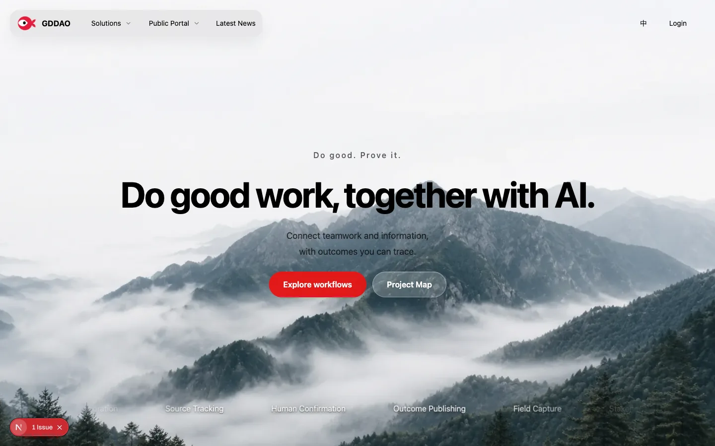
Homepage hero: one large narrative region per page, with media that supports the copy.
- 02
Public-entry card: functional color stays within its own entry and CTA.
- 03
Portal control: 44px default, 40px compact, and 8px radius.
- 04
Portal card: 16px radius and 1px border, without decorative shadows.
- 05
Floating layer: shadows are reserved for popovers, dialogs, and sheets.
Product previews
Real captures show how tokens behave in context.
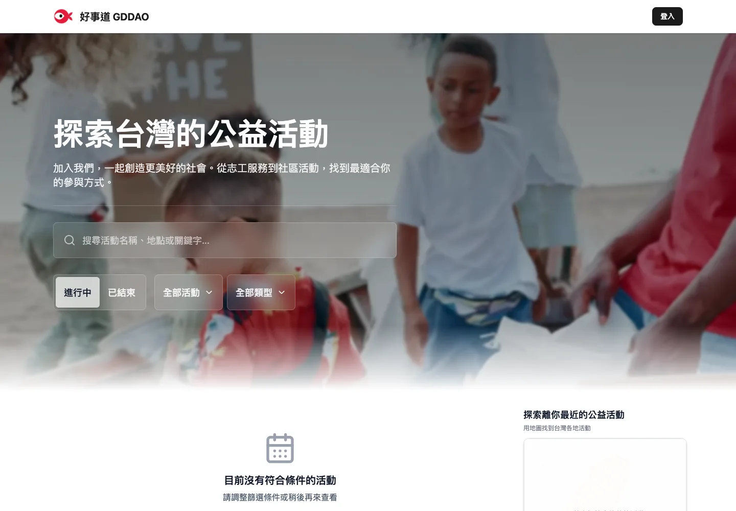
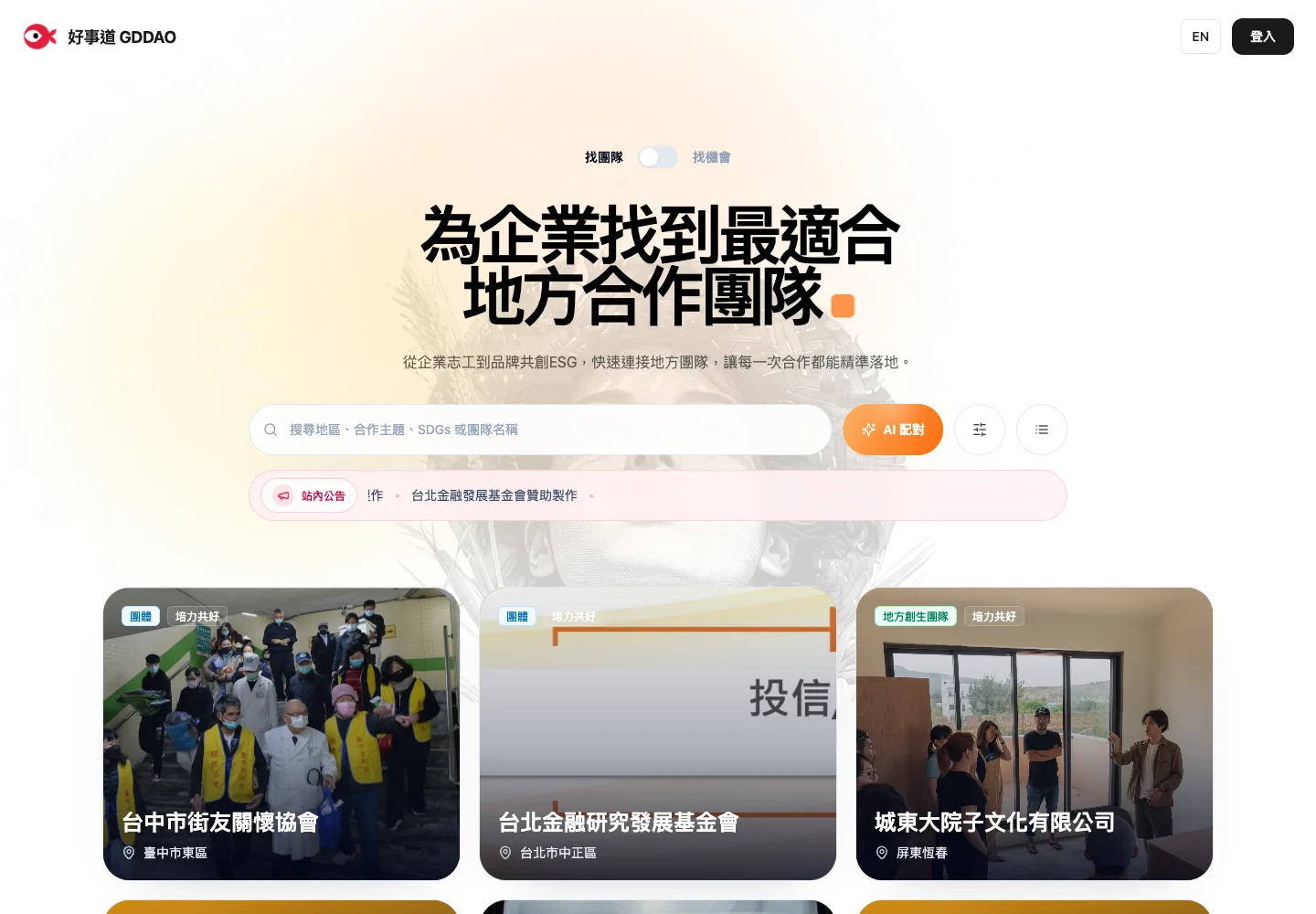
The file, before you copy it
Copy this platform design.md into an AI coding tool as styling context.
---
system: GuppyCubed Web
owner: GuppyCubed
platform: web
verified_at: 2026-09-22
method: restated-from-current-product-theme-and-captures
---
# GuppyCubed Web — Design Style Reference
## Summary
Two densities within one brand: the homepage and public entries use media, space, and display type for narrative, while Portal uses neutral surfaces, clear borders, and denser product hierarchy for work.
## Color tokens
### Homepage and public entries
| Token | Value | Role |
| --- | --- | --- |
| Canvas | `#FFFFFF` | Homepage and brand-content canvas |
| Ink | `#000000` | Headings and primary text |
| Conversion red | `#E11919` | Homepage primary CTA |
| Donation | `#F3D57A` | Donation CTA with dark text |
| Activity | `#F8DFC9` | Activity-entry surface |
| Matching | `#F9EDC2` | Matching-entry surface |
### Portal product interface
| Token | Value | Role |
| --- | --- | --- |
| Brand | `#C3102E` | Primary action, selection, focus |
| Brand hover | `#A20D27` | Hover and active states |
| Background | `hsl(0 0% 98%)` | Product background |
| Surface | `#FFFFFF` | Cards, forms, and sidebars |
| Muted | `hsl(0 0% 96%)` | Secondary sections |
| Border | `hsl(0 0% 90%)` | Dividers and component boundaries |
| Ink | `hsl(0 0% 10%)` | Primary text |
## Typography
| Role | Size / line / weight | Use |
| --- | --- | --- |
| Display | `48–72 / 56–80` | Homepage hero and large figures; at most once per page |
| Page title | `32–40 / 40–48` | Product and documentation page titles |
| Section title | `28–32 / 36–40` | Major sections |
| Card title | `18–20 / 28 · 600` | Cards, dialogs, and sections |
| Body | `16 / 26 · 400` | Explanations and continuous reading |
| UI label | `14 / 20 · 500–600` | Buttons, inputs, and tables |
| Metadata | `12 / 18 · 400–500` | Sources, time, and supporting information |
## Layout, shape, and motion
| Token | Value | Rule |
| --- | --- | --- |
| Spacing | `4 / 8 / 12 / 16 / 24 / 32 / 48 / 64` | All padding, gaps, and section spacing. |
| Accessibility | `4.5:1 · 44 × 44` | Normal-text contrast and minimum touch target. |
| Focus | `3px visible ring` | Keyboard focus never relies on color alone. |
| Content width | `680–720 / ≤ 1200px` | Reading measure and documentation canvas. |
| Radius | `8 / 16 / 24px` | Controls, cards, heroes and large containers. |
| Motion | `160 / 250 / 420ms` | Fast, base, and slow; reduced motion removes translation. |
## Component rules
- Homepage hero: one large narrative region per page, with media that supports the copy.
- Public-entry card: functional color stays within its own entry and CTA.
- Portal control: 44px default, 40px compact, and 8px radius.
- Portal card: 16px radius and 1px border, without decorative shadows.
- Floating layer: shadows are reserved for popovers, dialogs, and sheets.
## Product previews
### Brand homepage · Desktop
[](https://docs.guppycubed.com/en/img/guides/web/homepage-local-1440-en.webp)
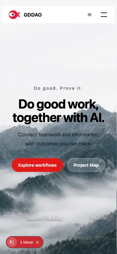
### Brand homepage · Mobile
[](https://docs.guppycubed.com/en/img/guides/web/homepage-local-375-en.webp)
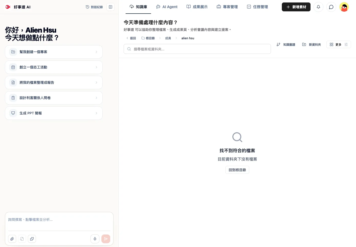
### Portal · Knowledge
[](https://docs.guppycubed.com/en/img/guides/web/portal-knowledge-empty.webp)
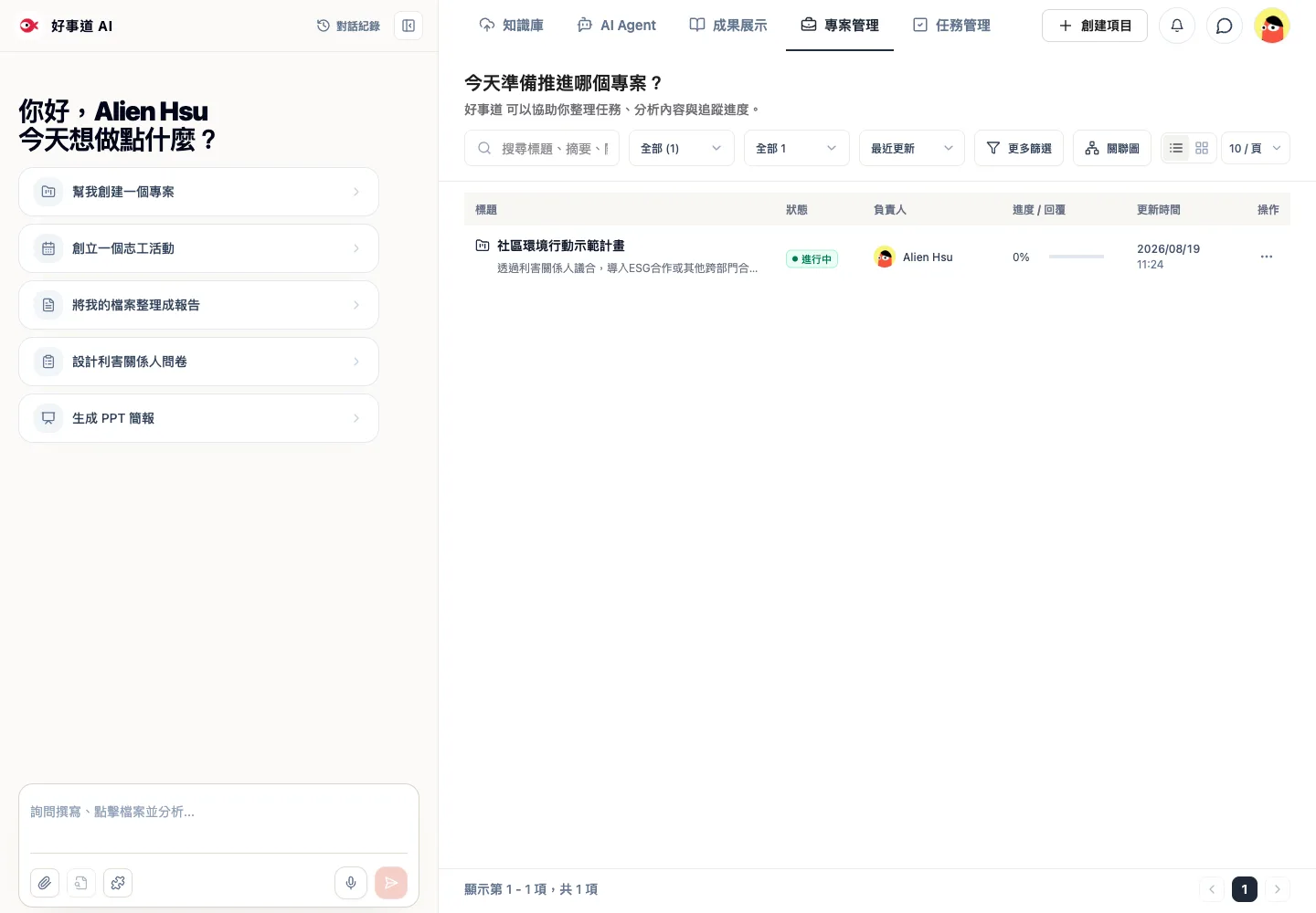
### Portal · Projects
[](https://docs.guppycubed.com/en/img/guides/web/project-list.webp)
### Public entry · Activity
[](https://docs.guppycubed.com/en/img/design-language/captures/web-public-activity.webp)
### Public entry · Matching
[](https://docs.guppycubed.com/en/img/design-language/captures/web-public-match.webp)
## Do's
- Identify the Homepage/Public or Portal context before choosing tokens.
- Give every impact figure a source and update date.
- Support product narratives with real product screens.
## Don'ts
- Do not use donation, activity, or matching colors as global Portal accents.
- Do not repeat homepage display density inside product pages.
- Do not use decorative impact figures that cannot be verified.
---
_Generated from the current GuppyCubed public design-language reference._
Homepage and public entries
The homepage uses display type, full-width media, a black-and-white foundation, and brand red to shape narrative and conversion. Donation, activity, and matching colors stay within their own entries instead of replacing brand red or becoming global Portal colors.
Portal product interface
Portal uses denser information, neutral surfaces, clear borders, and consistent control dimensions. Forms, tables, sidebars, and workspaces prioritize scanning. Shadows are reserved for floating layers such as popovers, dialogs, and sheets.
The complete set of 39 Web captures, categories, dates, and dimensions is available under Implementation captures and acceptance sources.